Colour is an ancient and infinite curiosity. One could dedicate their entire life to the study of colour and still end up with more questions than answers; in fact, Johannes Itten did just that!. Thanks in large part to artists like Monet, Seurat, and Itten, artists today can more easily understand the basic characteristics and guidelines of colour.
"Colour is my all-day obsession, joy, and torment"- Claude Monet |
The goal here is to get familiar with the basics of colour: specifically the colour wheel, value scale, terminology, and how this all applies to artistic media.
The Colour Wheel
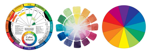
A colour wheel is simple tool for artists; usually arranged in a circle with different coloured segments, and serves as a visual guide to the relationships between colours.

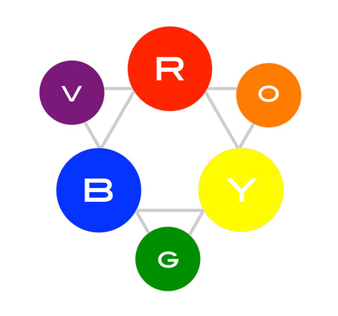
Primary Colours
- There are 3: Red, Yellow, and Blue
- Primaries are mixed with one another to create all colours in the colour wheel
x
Secondary Colours
- There are 3: Orange, Green, and Violet
- Secondaries are the result of mixing 2 primaries together

x
Tertiary Colours
- There are 6: Red-Orange, Yellow-Orange, Yellow-Green, Blue-Green, Blue-Violet, and Red-Violet
- Tertiaries are the result of mixing a primary with a neighboring secondary colour
x
Colour Value & Saturation
Value
The Value of a colour refers to it's lightness or darkness relative to White (the absence of all colour) and Black (all colours combined). Value is often measured in a numbered 1-10 scale (White is a Value 1 and Back is a 10) or it can be expressed simply in terms of High or Low Value.

Instead of guessing at a colour's value, try a Grey Scale Value Finder
Hue
When talking about colour theory, Hue refers to a colour in it's true and unaltered form; including all primary, secondary and tertiary colours with no added white, black or grey
Adding White, Black, and Grey
Tint - Adding White to any hue makes it a Tint
Shade - adding Black to any hue makes it a Shade
Tone - adding Grey (black & white) to any hue makes it a Tone

Saturation & Intensity
These interchangeable terms describe how vibrant or muted a colour appears relative to how much of the original, unaltered hue is identifiable. Intensity/Saturation are often described in terms of Low or High

An infinite selection of colours can be made using only the primary traid and variations of tint, tone, shade, value, and saturation!

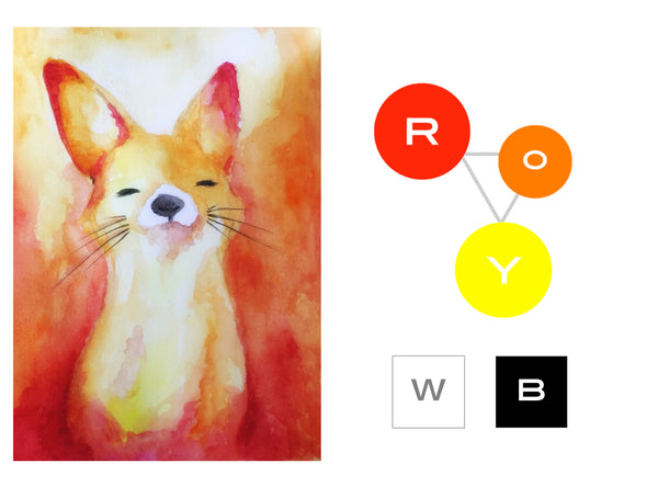
Colour Schemes
Although colour mixing options are endless, it's often recommended (for any artistic project) to limit your palette to a few colours or risk treading into rainbow vomit territory. The following are colour scheme concepts explained simply
Achromatic
- All colours are absent
- Black, White and Greys only

Monochromatic
- The use of only one colour and it's various tints, tones and shades

x
x
Analogous
- The use of three or more neighboring colours
- Also known as a Harmonic scheme

Complimentary
- Using two colours that sit directly across from one another on the colour wheel
- Each colour appears at it's truest when placed next to it's compliment


Split Complimentary
- A three colour scheme
Choose a colour that you would like to be dominant, then locate it's compliment. Select the two hues that sit on either side of the compliment. These three colours form a spit complimentary triad.

Triadic
- Another three colour scheme
- Any three colours that are equidistant on the colour wheel

Tetradic
- A four colour scheme
- Any four colours that from a right angled square or a rectangle on the colour wheel
Colour Temperature

Warm
- Typically colours that remind us of fire (Magentas, Reds, Oranges, Yellows...)
- Warm colours appear to advance (come forward, towards the eye)
Cool
- Typically colours that remind us of water or foliage (Yellows, Greens, Blues, Violets...)
- Cool colours appear to recede (move away from the eye, creating depth)

Bad Vibes

Chromostereopsis is a visual illusion where certain colours appear to vibrate, throb or flicker when placed next to one another. The effect is most noticeable when pairing high intensity complimentary colours, or where there is a marked colour temperature difference between any high intensity colours. The vibrating effect has everything to do with the illusion of colours advancing or receding against eachother. Complimentary colours could easily be seen as Frenemies becuse they bring out the best in each other but are also constantly at war.
The chomostereopsis effect can me minimized or halted entirely just by reducing the intensity (tinting, toning or shading) of one or both of the colours.

Neutrals
Neutrals

- The standard neutrals are Blacks, Whites, Greys and Browns
- Neutrals can also be created by mixing together two complimentary colours
- Characterized by a distinct lack of definable colour
- Many toned colours can be categorized as neutrals
- Can be either warm or cool in temperature
Colour and Art Media
Hue... again, but different
The word Hue has a completely different meaning when talking about paint manufacturing as opposed to colour theory. Seeing the word Hue on a tube of paint means that it's an approximated colour formulation (often using two or more pigments) meant to mimic the original colour.
Companies make colour hues for several reasons: To offer consumers a lower-cost alternative, to reduce a colour's toxicity, or because the original pigment is deemed non-archival or fugitive.
- ie: Alizarin Hue (often named Alizarin Permanent) is a higher quality colour than the original pigment (which is now known to be fugitive/fade).
Lightfastness
This term describes a paint's ability to withstand exposure to UV light without fading. Good quality paint colours are given ratings to indicate their lightfastness; usually a 1-3 scale with 1 being the most lighfast. If there is no rating on the tube, it's safe to assume the worst.
Colours that are not lightfast are referred to as fugitive.
Temperature... again, but different

Half of the colour wheel are warm colours and the other half are cool colours, right?
...Um, no, unfortunately basic colour theory is misleading when it comes to choosing paint colours. The reality of artist's paint is that true primary colours are rare, and even in the best case they're far from perfect.
Paint colour pigments are usually either a warmer or cooler version of that colour. When buying paints you'll have options like warm blues and cool reds. If you're just getting started in painting, it's a good idea to have one warm and one cool option in each of your primaries (6 primaries instead of three).
This chart shows a few examples of warm and cool options in primary colours

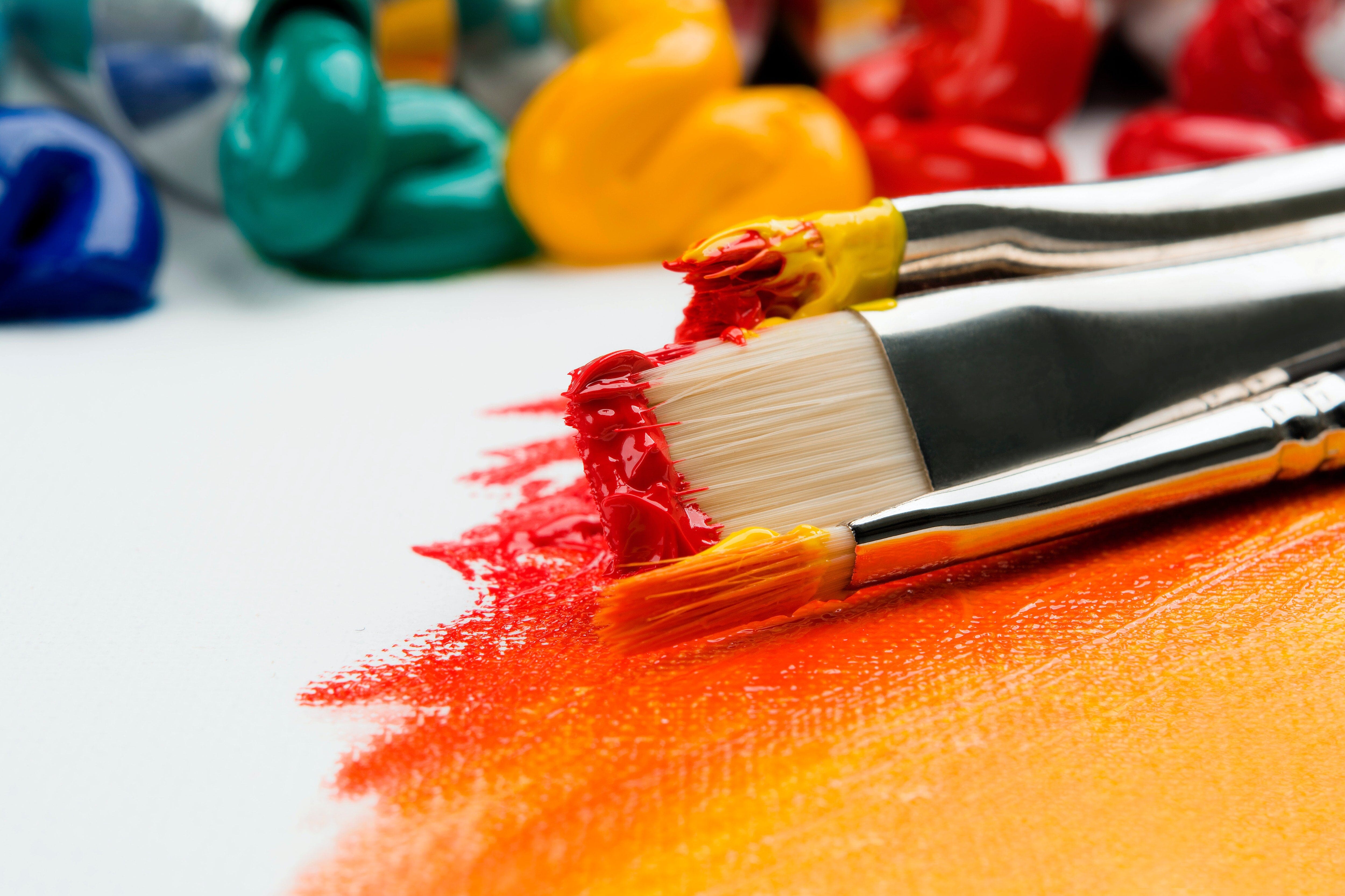
Masstone
A blob of paint straight from the tube is so highly saturated with pigment that it often appears to be a different colour than expected; this apparent colour is the masstone of that paint colour.
- ie: a blob of Prussian Blue appears almost black
Undertone
If one spreads a blob of paint across a white substrate (like primed canvas or paper) the masstone of the colour changes as the paint is spread thinner, revealing the Undertone.
- Ie: Prussian Blue (when drawn out) reveals beautiful dusty denim blue colours, even leaning towards turquoise in the thinnest areas.

Transparency, Opacity & Translucency

Transparence refers to a paint colour's ability to allow light (or previous paint layers) to show through from behind. For reference: a window is transparent

Translucent colours lie in the middle between transparent and opaque (often called semi-transparent or semi-opaque) allowing some light to pass through but details are obscured. For reference: a frosted window is translucent