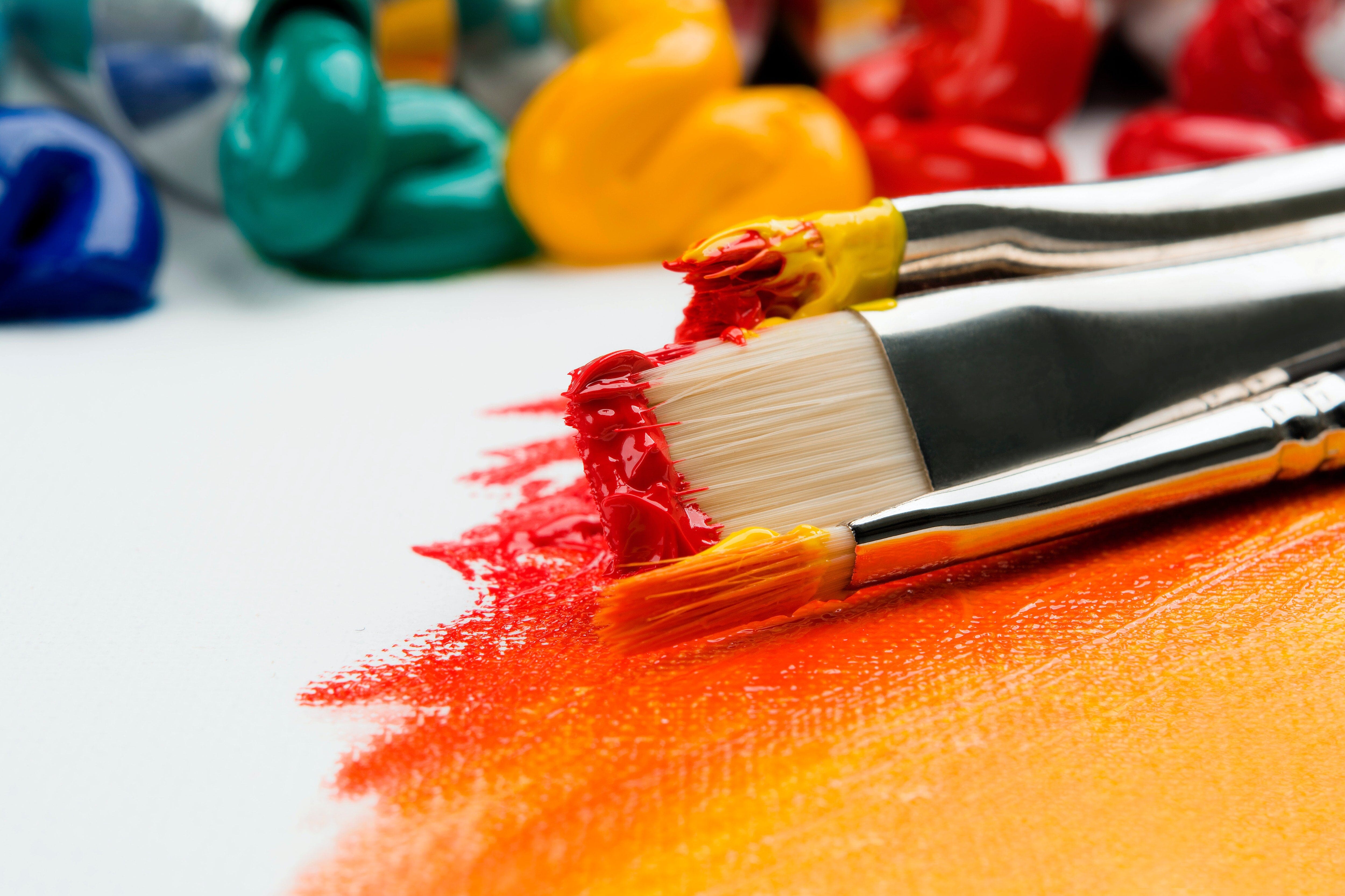
So, if you've been on the internet lately I'm sure you've seen the wide array of acrylic pouring videos flooding Youtube. In case you haven't, it's a technique of painting where acrylic paint is poured onto canvas or other substrates to achieve a kind of marbled look; the desired effect being the creation of colour "cells" (in which layers of different coloured paint sink or rise past each other rather resembling a cell, hence the term). It's fun, rewarding and can be done by just about anyone!
 This technique has been the collaboration of many individuals, so to say 'there is more than one way to do this' is an understatement! It first emerged in the 1930's from an artist named David Alfaro Siqueiros. (Pictured here) He simply poured different colours of paint one on top of each other and allowed them to spread and mix. So fascinated by what happened, he worked to discover the science of why. This question was taken up much later on by art historian Sandra Zetina and physicist Roberto Zenit. See this awesome article here to geek-out more on the science.
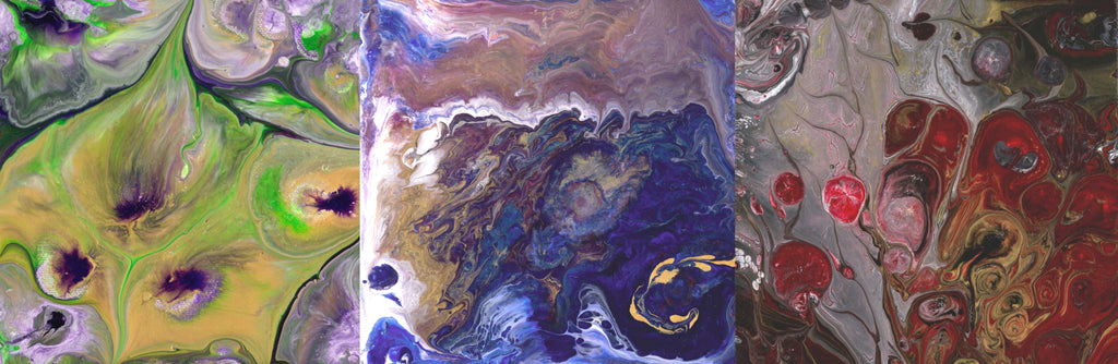
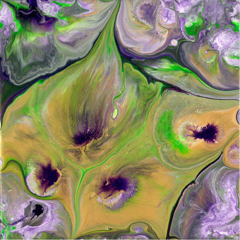
There are differing materials, techniques and of course results that have been developed with the magic of the internet. We've collected together a rough compendium of common pouring principles along with some basic info to give you a good starting point (plus a few experiments we did so you can try before buying, so to speak). And if you've already tried it, maybe this will just give you some more ideas to experiment with!
Getting Started: Materials
This section is for you if you've never tried this or are just curious to see how it compares. People use a wide array of products to suite their preference or budget; to say one is better than the other is really a matter of personal choice. That being said, some materials do differ in one large way: weather they are archival, or not.
Archival materials are professional art grade products that have been tested to see that they hold up to the test of time. This means they should retain their colour and texture and do not begin to deteriorate. This is not meant to say these are the only ingredients you should use, but be aware that doing otherwise can have unknown consequences.
There are lots of great products that produce fun and interesting results, but just keep in mind that not all were made with art as their intended purpose. What will happen over longer periods of time to these paintings is unknown (just a cautionary note to keep in mind). To successfully do this painting technique there are some material roles you're going to have to fulfill.
 1.) Colour - This role being filled by the acrylic paint but it is possible to use other kinds of paint, like tempera. We'll talk more on that later (see the kid friendly project). The ratio of colour to your other materials varies depending on your brand of paint but it's going to be about a 1:4 to 1:10 of your pouring medium.
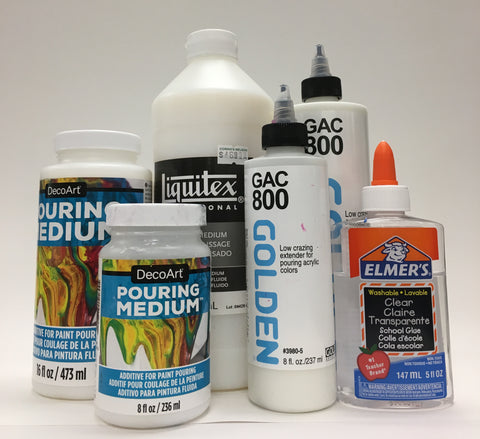 2.) Pouring Medium - The point of this product is to decrease the viscosity of your paint. This medium allows your mixture to spread out and give enough time to flow freely without drying right away. As an example, this role is often filled by Floetrol, GAC 800, White glue (we found the clear school glue worked much better), Liquitex Pouring Medium and DecoArt Pouring Medium to name a few.
 3.) A Resist Additive - This is something that will be added to the paint but doesn't blend with it. It breaks apart the surfaces of the various layers of different coloured paint in random locations, pushing it away to create that desired cellular pattern. This role can be fulfilled by a wide array of products, but typically it's a silicone product of some kind. Some popular choices have been hardware store silicone lubricant or caulking but these products are quite toxic as they are intended for more industrial uses. A more art-friendly option (which is non-toxic and easier to work with) is hair serum. Many beauty products contain a chemical called Dimethicone- this is actually a silicone. It should be noted that this is optional when doing a pour, but it's the easiest way to produce the cellular effect. One other way is to add isopropyl alcohol, this is less dense than water & doesn't blend with the paint but will evaporate quite quickly when it reaches the air; this method is archival-friendly but will produce different results from the silicone products.


Silicone Dimethicone Isopropyl Alcohol
4.) Substrate- this is just whatever surface you're pouring your paint onto; typically a flat, level, hard surface is best. Canvas also works great but take into account that it's just fabric stretched across a frame so if enough paint is poured onto it, it can pool in the middle. Pooling is usually only going to happen on larger sized canvas (a quick fix is to simply place a raised board inside your canvas frame to lay upon while pouring and drying). We did also try it on glass and wood board with great results!


GLASS CANVAS
One other tool that is again optional is a heat gun. Heat is used at the end, applied over the top of the final pour to pop air bubbles, it also encourages further spreading of the paint cells. Some folks use a handheld torch but a heat gun will work just as well. If you do use a torch please exercise caution as these are products that are safe at room temperature but if heated too high can off-gas harmful substances.
*If You Add Any Alcohol-This Is Very Fammable So NO Adding Heat When Using That Method.*
Safety first Egon ^_^
5.) Cups. As the technique suggests, you're going to pour stuff, so you're going to want a number of cups or containers to mix up your paint and pour from. Recycled, clean, plastic containers or plastic/paper drinking cups work well. Measuring cups work great too but make sure these are for paint only once used. I would like to encourage washing out cups to re-use them or using glass or metal containers. (Otherwise that's a lot of plastic waste at the end of a fun project, so lets do what we can to reduce that!)
Prep:

It almost goes without saying but this is going to be messy! Prepare. You'll want a flat working space that I suggest covering in plastic or newsprint. Your pouring substrate (canvas, wood board ect.) should be raised to allow for runoff. A quick easy way is to prop it up on some empty yogurt containers or spare cups. Support the corners to maintain a level surface. A lazy susan works pretty good as a support for small projects, just make sure if your using canvas that it's being supported by the wood frame and not the canvas fabric. One other thing I strongly recommend is wearing gloves. The pigments found in paint aren't the best thing to have on your skin and you are going to be covered in paint. Gloves just make for a much cleaner, safer experience for you.
The Process:
MIX: Now there are lots of different ways to go about this, but first off is the mixing. In a cup or resealable container you'll mix together your pouring medium with your choice of colour. The ratio will vary depending on the products you use for this. The higher quality of paint used, the less of it you'll need for the mixture; this is because they have a higher ratio of pigment in them so the colour remains strong even with very little. Golden brand paint mixed strong enough at about a tenth of the pouring medium but the Deco art paints needed to be about 1/4 of the mixture. Keep in mind, If you start with a thicker paint you may need more pouring medium to adjust it to the right consistency: A heavy body acrylic needs a little more medium than a fluid acrylic to get it runny enough. As previously mentioned, the point of the medium is to change the viscosity so the texture your aiming for is a bit runnier than pancake batter. Because it's hard to give you an exact measurement for every possible paint you may use I encourage you to gauge it by texture, and by starting with small amounts and adding a bit more at a time.
As for how to determine the amount of paint to cover an area, here is a good way to figure that out:
I have done a lot of mathematical thinking on your behalf (so hurray for me!) The folowing is a general formula to gauge how much paint you need to cover a surface area. (The calculation here assumes a 1.5mm thick film which is lots.) First, measure your surface in centimeters, include the sides of your item if say you have a deep canvas you want covered all the way. Also keep in mind this can vary depending on the absorbancy of your substrate so there is wiggle room.
Length in cm x Width in cm x Height of 1.5mm = Volume in cubic cm
÷ 10 = ml Of Paint Needed.
Example:
6''x 6'' board - 6'' = 15cm
15cm x 15cm x 1.5mm = 337.5cm cubed ÷ 10 = 33.75 ml of total fluid needed.
It's perfectly fine to go a little over your estimate to give yourself a little extra paint to work with. Once your paints are mixed, it's best to seal them up and leave them to settle over night. This allows all the air bubbles trapped in while mixing to escape. You can still go ahead and and pour right away if you can't wait, but even leaving it for an hour sealed up will help (be prepared for some air bubbles). If you use the silicone or alcohol additive this won't get added until just before you pour. The amounts again vary but it will be quite minimal: a drop or two for most silicone products, and less than 1/5th of your mixture for alcohol. These ratios can vary so let texture be your guage (you don't want it to be like water, that's too far). It will still make art but it will just look way different. Add the resist to each of your mixtures just before pouring and only with a minimal quick stir (a stroke or two). More mixing makes smaller cell pockets form and less mixing makes bigger pockets.
THE POUR:
So here is where you can go in a bunch of different directions. I'll list some of the ways you can do this. Remember: this is only a guide, not a biblical text, all of these "rules" were made up by people just trying out new things so feel free to experiment and be creative!
Flip: If your going to use one of the aforementioned resist additives, go ahead and add that now to each colour (or skip some to change the look up). These are all going to be slowly poured one over the other, layered within a single cup. Pour the liquid close to the wall of the cup to avoid air bubbles (like you're pouring a beer).

For best results you should order the colours you've chosen from heaviest to lightest. What causes the interesting effects is when more dense colours sink and lighter density colours rise. For the nerds in the room this war of density in physics is called Rayleigh-Taylor instability. (yay, science!) "But how do I figure out density of paint?" you may ask. Well the very nice people at Golden Paints have made a handy dandy chart that lists the colour pigments in the order of their density.... That baby is right here. Pour the heaviest colour in the cup first then add each subsequently lighter and lighter colours. This is why you see a lot of white done first: it's very dense and therefore will sink down through your lighter colours.

Pictured here are the same three paints layered in two different orders. Starting from the bottom up, on the left : Quinacridone magenta, Mars black, Titanium white. On the right: Titanium White, Mars Black, Quinacridone magenta. You can see how the first picture shows mixing when left on it's own but in reverse they simply sit on top of each other.
You will be mixing up your chosen colours so it's good to keep that in mind. If you put yellow and blue in your pour you're going to get some greens and so on. Take a bit of time to think about how the colours you choose will mix together. It's very easy to consult a colour mixing chart if your unsure what makes what. Here's some basic colour theory...
YELLOW + BLUE = GREEN
BLUE + RED = VIOLET
RED + YELLOW = ORANGE
YELLOW + BLUE + RED = BROWN MUD
Once your colors are all layered in the cup, you're going to flip them upside down onto your substrate. Place the substrate (the board, canvas or whatever) over top the cup with all your colors then flip. Hold the cup tight in place for bit to give the paint a chance to settle somewhat, then slowly pull up and watch the fun happen. You can tilt the pour to and fro to cover the surface and change up the patterns you're seeing.

Pull: I have dubbed this technique pull because it generally involves taking a cup you've prepared for flipping and pulling it across the canvas once you've flipped it. You can apply a strainer over the cup like a lid before flipping and then pull it across the canvas to create patters or just leave it as is. You also can lay a layer of colour down on your substrate first to give it some kind of starting background (gold, black, rainbow, whatever).

Straight Pour: for this technique, pour your colors onto each other directly on the substrate rather than in a cup. You can do it all from the center, from side to side, diagonally, or however else you can think of. Keep in mind, pouring this way you'll want your light density colors first and your heavier density last. Again this is not law just suggestion be creative ^_^
Swipe: Do just as mentioned above but you take a palette knife or other straight edge item and very gently drag it (just barely) over the surface of the pour, pulling colours over one another. White is a good colour to do this with if you use it last and scrape it over the surface of another colour it will sink and mix. For example: say you poured a line of white next to a line of black that was next to a line of magenta paint. Taking a palette knife you could start at the white line and "swipe" across the surface pulling some paint over onto the next colour and so on.
String Pull: First perform the pour however you wish. Once the paint is down on the canvas, take a string (something absorbent works best) and dip it in the remnants of one of your colours or another colour entirely if you wish. Drape the paint loaded string over you painting in a random pattern let it sit for minute or two and then gently pull it away or down. You can also lay the string down first and do your pour over it then pull it down after.

There are all sorts of ways you can play with a pour! You can pull out a pallet knife and draw it through the paint making new swirls.

You can use other mixed media bits like gems, glitter, gears etc and add them to the surface of your pour while drying. You could whip out a straw and gently blow through it over your painting to move around the colours. Or take a bottle of rubbing alcohol and drop a drip at time over top to create ringed patterns.

Scoop up some of your drippings and drop them over your painting with a pallet knife. Do more than one flip cup on a single canvas.

You could do a pour on something different like a sheet of acetate which could once dry then be peeled off to make a "skin" of acrylic. *Tip*A bit of warm water can help in the removal process. This can be collaged with or added to any mixed media painting by just the addition of some adhesive or acrylic medium.

Pour On Glass:
We even tried DecoArts multi-surface paints mixed with DecoArt poring medium and did a flip on a glass pane from a picture frame. The paint does behave differently and takes longer to dry. I had to leave it for about 2 days to completely dry.

 FRONT BACK

Kid Friendly Non-Toxic Pour:

So you can even do this with kids!
Substitute the acrylic paint for children's non-toxic tempera paint and sub the pouring medium with Elmer's clear glue. Adding the hair serum as a resist works well (and is totally skin safe, just no eating of the paint). You could instead add isopropyl alcohol which will evaporate but it is kinda whiffy and still shouldn't be ingested.
This mix can be used with all the various techniques and it looks pretty awesome. The ratio of paint to glue will vary but it's going to be close to a quarter or third of the glue amount you use. So three parts glue to one part paint. As you can see below the results are pretty good!
These are just some ideas and I'm sure you could come up with even more. This style is abstract there are no rules....except don't eat the paint. But other than that, have fun!