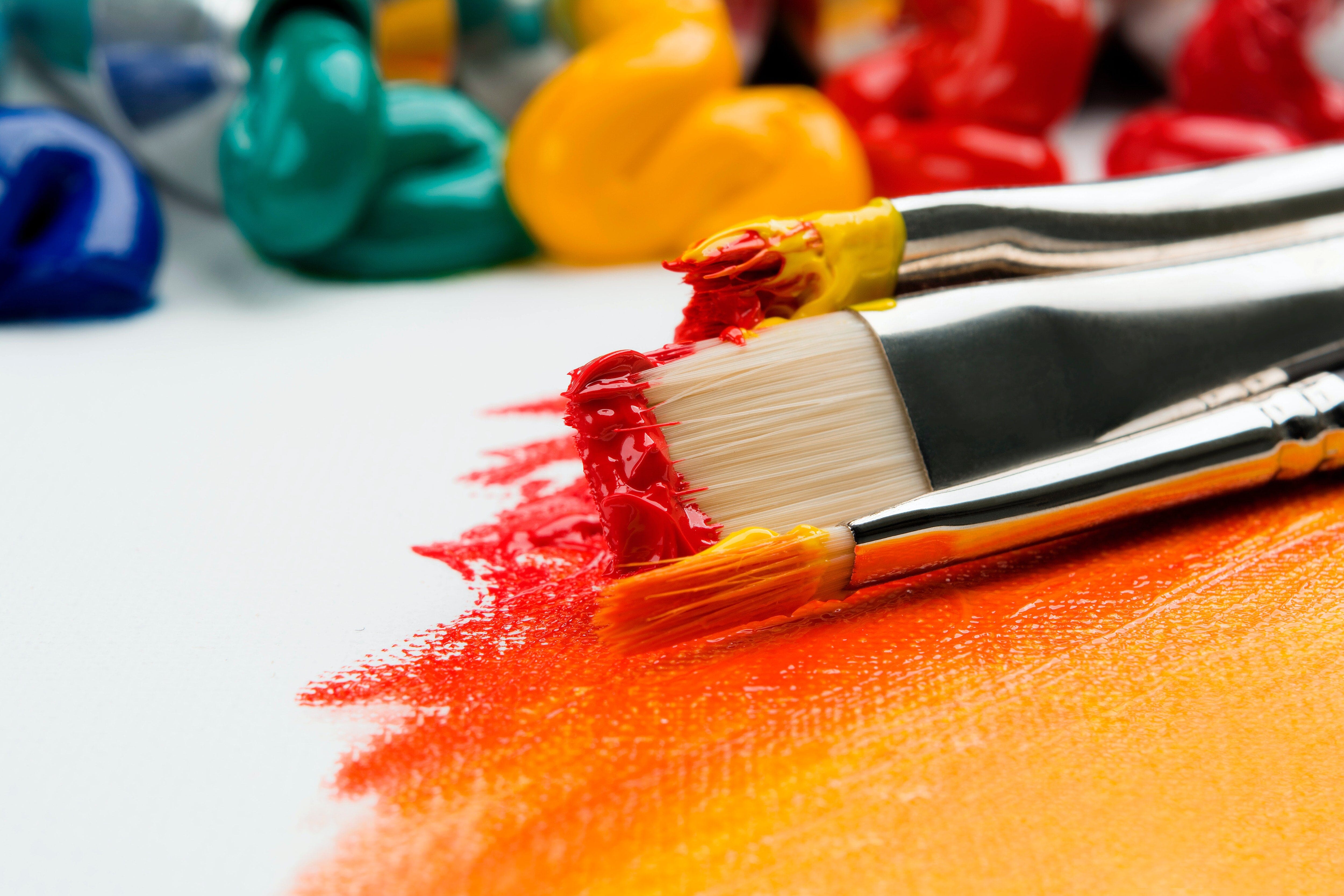
Mixing from primary colours gives you a wide array of potential hues and potential drama, but how does one go about choosing a primary colour palette? When you're standing in front of a bunch of massive paint displays, choosing colours can feel like an overwhelming task. Whether you paint in oils, watercolours or acrylics there are actually just a few simple factors to take note of.
The Basics
For those of us who haven't painted a colour wheel since grade school, this is a basic colour wheel:

Primary Colours
In terms of painting, RED, YELLOW & BLUE are the primary colours.
Secondary Colours
Using the three primaries you can mix the three secondary colours: ORANGE, GREEN & VIOLET
Tertiary Colours
Using primaries and secondaries you can mix the six tertiary colours:

- RED-ORANGE
- ORANGE-YELLOW
- YELLOW-GREEN
- GREEN-BLUE
- BLUE-VIOLET
- VIOLET-RED
About Blacks
By mixing your three primary colours together you can create a very dark blackish hue. This mixture will never be jet or carbon black. A mixed black is less stark and is closer to colours seen in nature which is preferred by many artists.

If you do require a lot of black then buying a tube of black for mixing will make life much easier. There are three basic blacks to choose from:
- Lamp Black/Carbon black - coolish, slightly blue-ish undertones, opaque, finely ground pigment
- Ivory Black/Bone Black - warmish, slightly muddy undertones, semi-opaque, very finely ground pigment
- Mars Black/Iron Oxide Black- neutral undertones, opaque, fairly large pigment particles

About Whites
There are two basic whites to choose from:
- Titanium White - very opaque, excellent for mixing
- Zinc White - very transparent, great for glazing (too transparent for use in mixing)
For watercolourists, there exists a Chinese White: a combination of Zinc and Titanium pigments.
For oil painters there exists Flake/Underpainting/Cremnitz/Silver White: made with lead white pigment which is extraordinarily toxic ...don't touch it, don't breathe it... just don't use it.

About Paint Quality
If you are buying just a few primaries (plus a white and black) then I always recommend that you opt for the better quality paint. Professional paints have a higher pigment load; this means they contain a higher ratio of pigment to binder and therefore more saturation, yielding a much better mixing result while also using less paint!
Pigments: Hues vs Genuine
If you're aiming for the truest mixing results try to avoid colours containing the word hue at the end of the colour name (such as Cadmium Red Hue, Cobalt Blue Hue). The word "hue" does mean colour, however in the terms of paint-making hue means that the colour in question is an approximated formulation; that it does not contain the genuine pigment that it's name indicates (ie: Cadmium Red Hue contains no cadmium at all, Cobalt Blue Hue contains no cobalt).
Hues are often less expensive than their genuine counterparts, and are also generally less toxic, and where the original pigment is not stable or not available, some hues are an improved formulation (ie: Indian Yellow genuine was made from concentrated cow urine, so... yeah, I'll take the hue, thank you.) The potential problem lies here: hues can be formulated using several pigments to create one colour which can muddy your results when mixing. For mixing vibrant colours you'll want to pick primaries colours that contain only a single pigment.

Alizarin crimson is one of my favorite colours, however, recent studies have shown that the pigment traditionally used to formulate Alizarin (PR 83) is not stable enough to qualify as a professional colour (it's not lightfast). As a result of these studies almost all professional paint makers have developed a new (improved) alizarin hue (often named Permanent Alizarin Crimson). This new hue is far a more stable formulation for alizarin but it is composed of three pigments: two red pigments ...and a green.

Mixing the original Alizarin Crimson with a Phthalo Blue creates a lovely eggplant purple (see above image). In my experience I've found that when using the new Alizarin Hue with Phthalo Blue the resulting purple has lost some vibrancy and has more pronounced brown tones to it (because of the addition of the green pigment).

Reading Pigments
Pigments are written on the label of any good paint. Every pigment has an identifying "colour index name"; they almost always start with P (for pigment) followed by a letter (indicating colour) and a number (indicating the exact chemical ingredient).
- PY ... = yellow
- PR ... = red
- PB ... = blue
- PG ... = green
- PW ... = white
- PBk ... = black
The number indicates the exact chemical used in the colour
- PY 74 = pigment yellow 74 (arylide yellow)
- PY 175 = pigment yellow 175 (benzimidazolone yellow)
Picking Primaries
Some very reliable Primary Reds:
| Quinacridone Red | Pyrrole Red | Naphthol Red |

|
 |
 |
| Cadmium Red Light | Cadmium Red Medium | Cadmium Red Deep |
 |
 |
 |
Some very reliable Primary Blues:
| Phthalocyanine Blue | Cobalt Blue | Ultramarine Blue |
 |
 |
 |
| Primary Cyan | ||
 |
Some very reliable Primary Yellows:
| Hansa Yellow | Cadmium Yellow Light | Azo Yellow |

|
 |
 |
| Cadmium Yellow Medium | ||
 |
Using Unorthodox Primary Colours
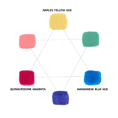
Using any of the primary colours suggested above will yield a fairly normal and reliable colour wheel, but you can spice things up by choosing unusual primaries and the results will surely surprise you!
Instead of looking for the truest colours with single pigments, look for weird colours, even multi-pigment colours; pick a reddish colour, a blue-ish colour, and a yellowish colour.
The first example:
- Naples Yellow Hue
- Quinacridone Magenta
- Manganese Blue Hue
The second example:
- Iridescent Bright Gold Fine
- Light Magenta
- Prussian Blue Hue
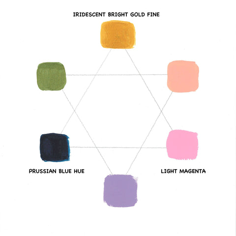
If you are trying to achieve traditional primary and secondary colours, this result may be disheartening or frustrating. These unorthodox colour spectrums have lost a significant amount of vibrancy but they are still pleasant palettes of soft, muted colours.
If you're looking to create a specific mood in your painting, don't be afraid to play around with your selection of primary colours; it will give you many gorgeous and unexpected options